Re-Hood
Re-Hood is an e-commerce platform for a hoodie brand made for people who care about the planet — but also about colour, contrast, and self-expression. The goal? To design a storefront that stands out visually, feels effortless to use, and helps the brand turn bold values into real sales.
• Eco-fashion felt muted — neutral colours and minimal designs left little room for personality. • 75% of users found it bland or forgettable, making it hard to form a lasting connection. • 50% abandoned carts due to clunky UX, confusing layouts, or unclear returns. • Users wanted trust but couldn’t find transparency, clarity, or real interaction.
How did I solve it?
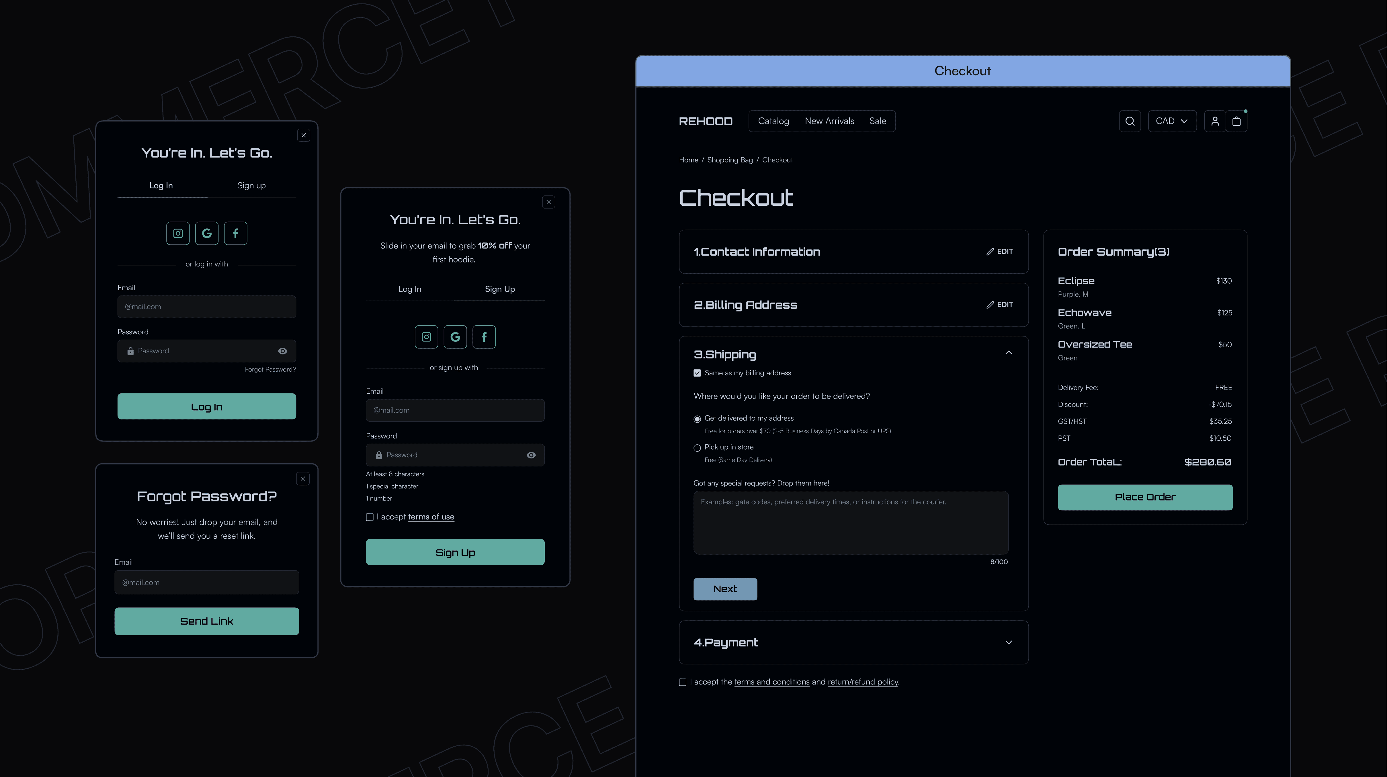
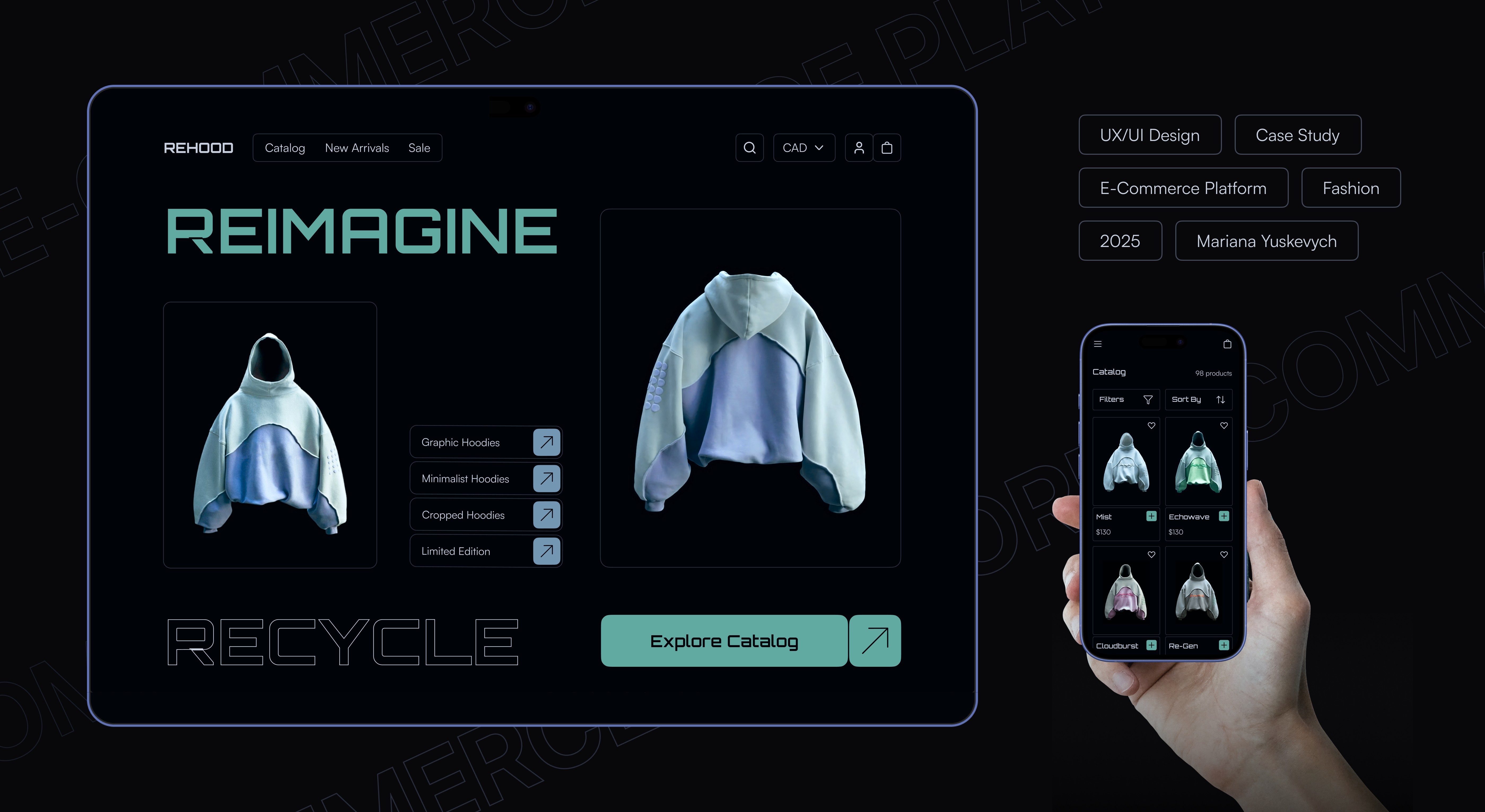
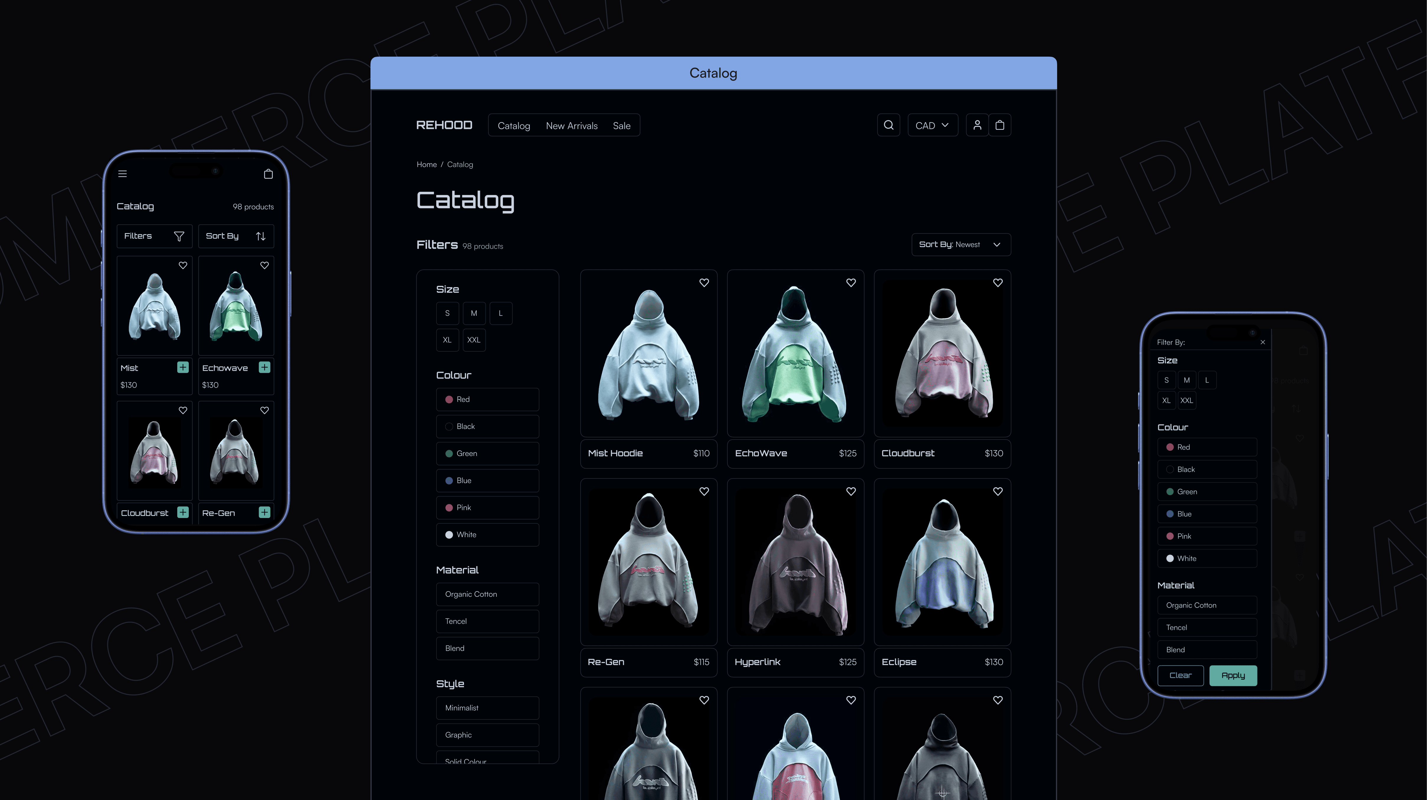
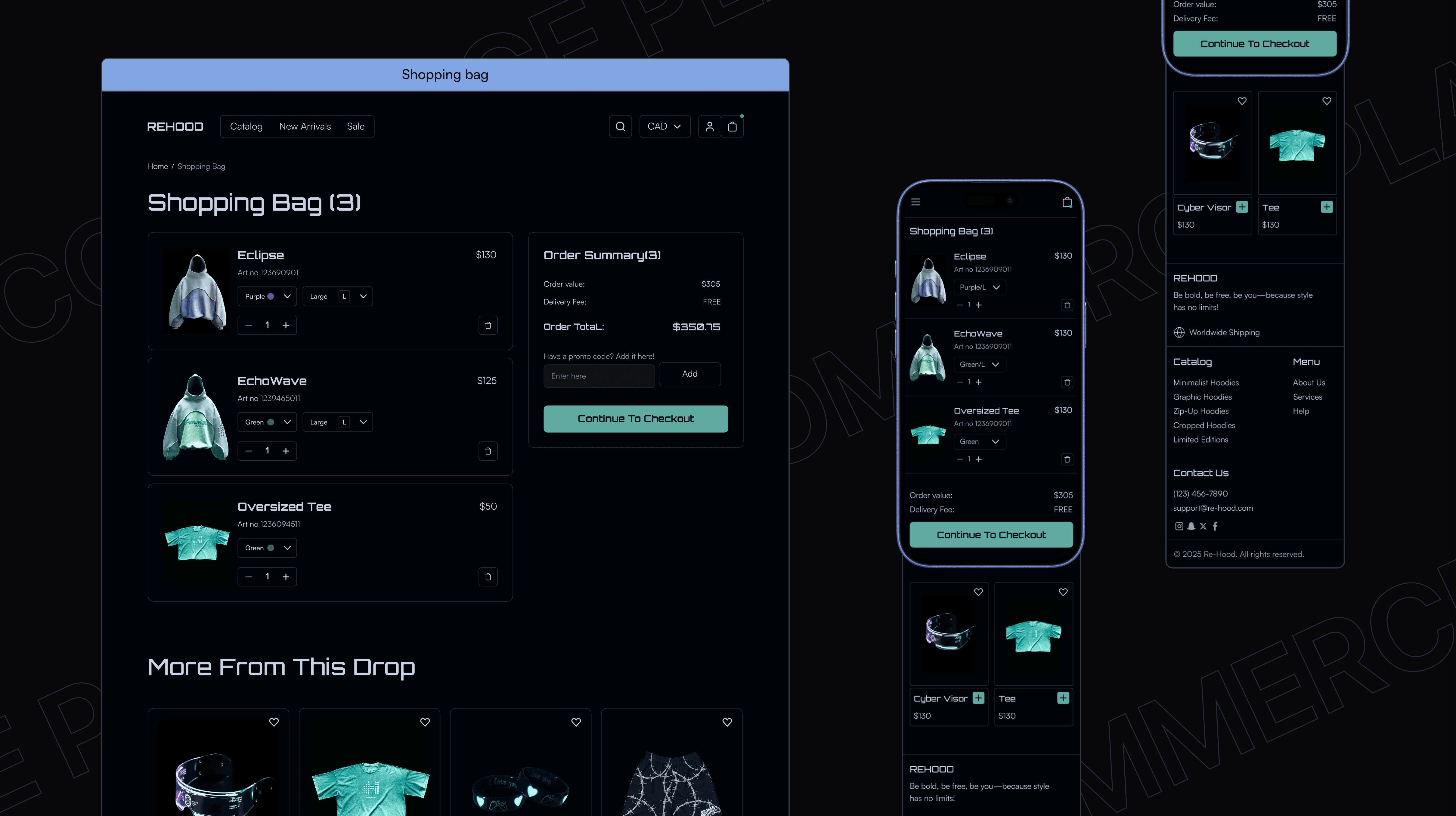
• Designed a clean, intuitive shopping platform that achieved 100% task completion in 6.5 minutes. • Created a custom visual identity that made eco-fashion feel expressive and boosted brand appeal. • Developed a checkout flow with clear cues and microinteractions, raising satisfaction to 4.5/5. • Added transparency through layout and copy, increasing user trust and encouraging repeat visits.
I began by speaking with the client to understand their vision, then collaborated with a team to define two core user groups. We ran a survey, analyzed competitors, and mapped user needs. I moved into wireframing and tested early versions to refine usability and cut unnecessary development costs. After defining a style guide, I kept iterating on layout and interaction until I was fully satisfied with the final outcome.
Challenges?
Balancing bold visuals with accessibility on a dark UI wasn’t easy—especially with tight time and budget limits. But those limits pushed me to think sharper, test faster, and focus on what mattered most. Early feedback caught what wasn’t working, and staying open to critique helped me grow as a designer. I kept tweaking, refining, and adjusting until everything finally clicked.