

Tea harmony
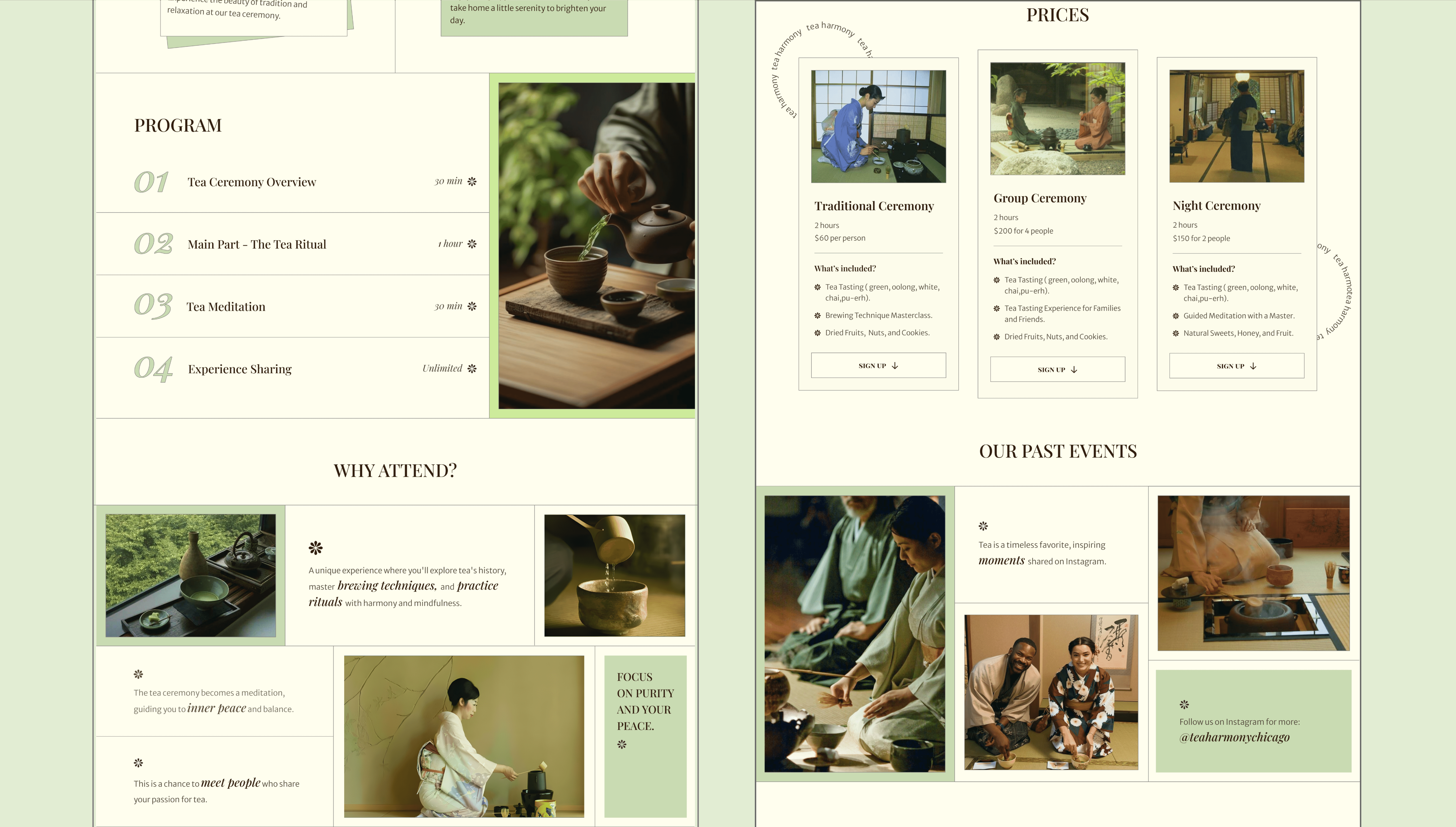
I designed a soft-toned, modern landing page for a tea ceremony brand to help them reach new clients and boost bookings. Soft visuals, gentle pacing, and intuitive structure reflect the ritual’s essence and invite users to slow down.

So, what's the problem?
• Tea Harmony offered a mindful in-person experience, but there was no digital space to reflect that feeling. • The brand lacked a strong visual identity online, so it didn’t leave a lasting impression. • There was no clear way to guide new visitors toward events or deeper engagement — just a static page with no real journey. • The experience didn’t build awareness or share the story behind the brand — nothing that would make someone pause, connect, or come back.
How did I solve it?
• I designed a calming, focused landing page that mirrors the ritual of tea itself which is rooted in presence. • Built a soft but distinctive visual identity system that helped the brand feel more aligned with its values. • Added subtle interactions and intuitive navigation to gently guide visitors toward learning more and signing up for events. • Brought the brand story to life through visuals and copy to create a cohesive brand experience that invites users to slow down and feel present.

What was my process?
I started with research to understand the audience and spot gaps in competitor sites. Then I gathered references and sketched ideas to explore tone and layout. I built out wireframes, tested the flow, and refined the structure. Finally, I defined a calming visual style, built a UI kit, and wrapped it in an animated prototype.
Challenges?
Balancing minimalism with clarity wasn’t easy. It took a lot of tweaking to keep the layout clean without making it feel empty. The real challenge was designing calm without being boring. This project showed me how design can create emotional connection, making someone feel something even before they click.


